Guide
What each layer draws, how to stack them, and the ready-made recipes — plus an honest account of where the map stops being trustworthy.
This is the same text that ships inside the Complete Map, published here in full so you can read it before deciding whether the map is worth anything to you.
Prepared Ground — filtering this map in Google Earth
Each layer is its own .kmz, in layers/. Import them as map features (not as a data
layer — that strips the colours and flattens the folders, and the whole thing stops working).
Import only the layers you are about to read. Google Earth holds roughly 10,000 features
and 250,000 vertices per project; the whole set is many times that, so it will not all fit in
one map and does not need to. The table in README.md gives the cost of each layer, and the
recipes below name two or three at a time on purpose.
Filtering here is checkbox work. Every layer and sub-layer has its own tick box, so you narrow the search by choosing which overlays are drawn and then looking for ground that stays clear.
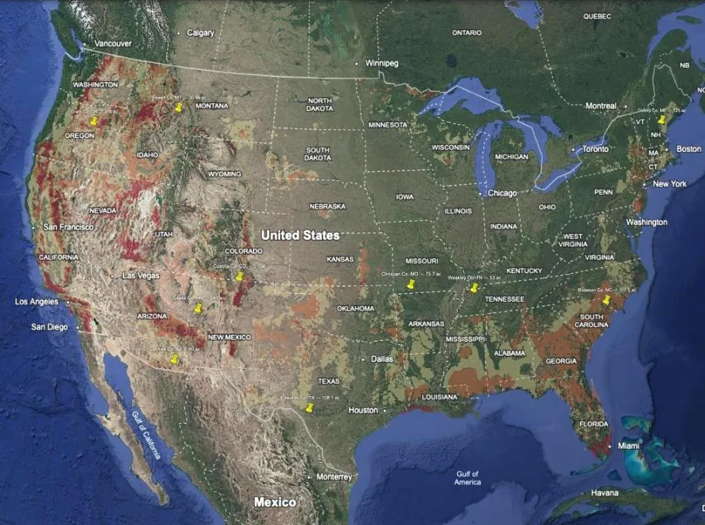
The core trick: most layers only draw the bad stuff. Unshaded doesn’t mean “no data”, it means “fine”. Turn on the problem categories, turn off the acceptable ones, and the land you want is whatever is left uncovered.
Everything arrives switched off. Read the map a layer or two at a time.
Where to start. Start with whatever worries you most — wildfire, water, distance from a city, state law — and import the one or two layers that answer it. If you have no shortlist yet, your free State Screen (preparedground.com/free-map) ranks every county in your state and is small enough to sit underneath anything else in this set, so it gives the filters somewhere to point.
The layers, as filters
County Trajectory
Population change 2020–2024, every county drawn. Not a filter so much as a corrective: run it alongside whatever else you are reading, because the quiet, cheap, well-watered counties are overwhelmingly the ones people have been leaving.
Well Depth
Typical depth to water, and what that costs to drill. Deeper is worse. This is usually the single largest unplanned cost on rural land.
Water Rights
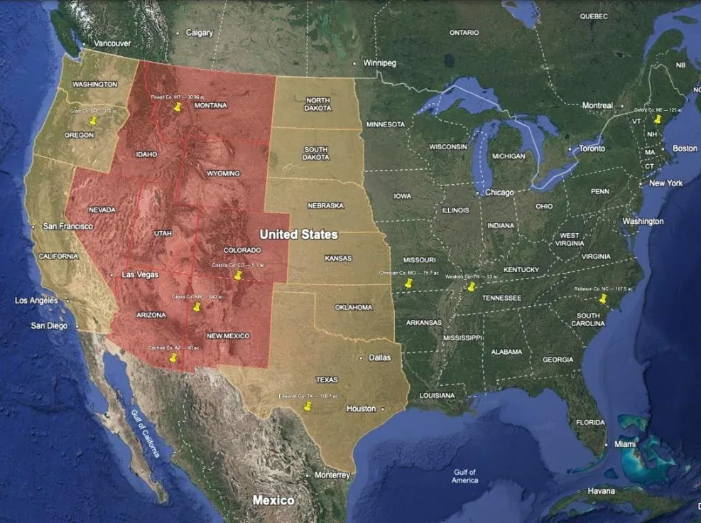
Only the difficult states are drawn. Unshaded = riparian = the good case. Where it is shaded, buying land on a creek does not give you the right to use the creek.
Groundwater is usually governed by a separate rule from surface water in the same state, and most western states exempt small domestic wells. This layer tells you which states need a call to the state engineer, not what the answer will be.
Annual Rainfall
Ten bands of total annual precipitation, drawn on a 5-arc-minute grid rather than averaged to a county — a county mean says nothing in mountains, where the valley floor and the ridge above it can differ by a factor of five. Every band draws, so it reads as coverage until you start switching bands off; leave only the range you would accept and it behaves like the other filters.
Two lines carry most of the weight. Twenty inches is where dryland farming stops being a gamble — below it the water right and the well are the whole question. Forty inches is where the problem inverts, and keeping water out of a building, a road and a septic field costs more than getting it in.
It is precipitation, not rain: every band includes the water equivalent of snow, so read it
with Climate Classification to tell 18 inches of snowpack from 18 inches of
thunderstorms. It is also the heaviest layer in the set at about 147,000 vertices, so it
does not stack with much.
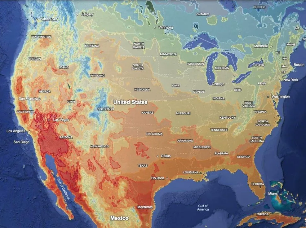
Temperature — Winter Low / Summer High / Annual Mean
Three layers, not one: each is 80,000–130,000 vertices and Google Earth will not hold
all three at once. Winter Low is the mean daily minimum of the coldest month,
Summer High the mean daily maximum of the warmest, Annual Mean the average of the
whole year, day and night. Every band draws, so switch off the ones you are not asking
about and the rest become a filter.
Winter Low is not a hardiness zone. A USDA zone is the average annual extreme
minimum — the single coldest night of a typical year — which is colder than the coldest
month’s average night, and not by a fixed amount. Read a band as the winter a place has;
read a zone map for what a plant has to survive.
Against the 7,092 NOAA stations inside the window, the grid carries the annual mean to
within half a degree but compresses the daily swing: summer afternoons read about 1.6 °F
low and winter nights about 3.3 °F high. So lean hot on Summer High, cold on Winter Low, and take Annual Mean as it stands. Each layer’s description shows the full
measurement, by region and by elevation.
Wildfire Hazard
Only Moderate, High and Very High are drawn. Unshaded = low risk. Turn off Moderate
to see just the serious ground.
Reads fire likelihood, not destructiveness — the Southeast lights up for frequent low-severity pine fires, which is a different problem from Western crown fire.
Seismic Hazard
Five bands of design ground motion. Only matters for what you build and what it costs to insure; irrelevant to most of the eastern half of the country.
Radon Zones
All three zones draw by default. Untick Zone 3 (and usually Zone 2) so only Zone 1
shows — then it behaves like the other filters, where shaded means avoid. Any house can be
mitigated; this is a cost signal, not a disqualifier.
Prime Farmland
Share of each county classified prime farmland by soil survey. Higher is better if you intend to grow anything, and it is also a land-price signal. Alaska is absent because the soil survey carries no farmland classification there.
Growing Season
All eight bands draw, on a diverging scale: green peaks in the middle, red at both ends. Too long is as wrong as too short. To use it as a filter, leave ticked only the bands you would accept.
Emergency Access
Road distance to the nearest hospital with an emergency room, in five bands. The bands above 30 miles are the ones to look at.
Broadband, and Broadband Availability (Canada)
Share of households with a fixed broadband subscription. Low bands are the problem bands. Satellite service changes this calculus, so read it as “how hard will the incumbent make this” rather than as an absolute.
Remote and Connected
The overlap layer: remote US counties where a real wired or fixed-wireless connection can still be bought, scored 0–100. Anything not remote is screened out rather than ranked low. Connectivity reads the rural locations only, so a fibre build that stops at the county seat does not flatter the country around it. Satellite is left out of the score because it is available almost everywhere; the balloon reports it instead. Read a high score as “worth a phone call” — these are providers’ claims, not measured speeds.
Property Tax
Effective rate on owner-occupied homes. The recurring cost of holding ground, which over a long enough hold outweighs the purchase price difference between two counties.
Public Land
Share of each county in federal, state or other public ownership. Ambiguous by design: access and buffer on one hand, restrictions and fire exposure on the other.
City Proximity — USA, Canada, Mexico, Central America & Caribbean
Four separate layers, one per region, so you can switch off the ones that do not matter. Rings scale with population, 50 miles at 250k up to 200 miles at 8.5M, sub-foldered by size.
54% of all US counties fall inside a ring, so treat these as “how deep in” rather than pass/fail. The edge of a ring is not a wall. Note the three non-US layers are anchored on cities rather than metro areas, so one urban area can draw several nested rings — greater Mexico City accounts for seven.
Building Codes
All three draw. Ambiguous by design — “Not Resistant” means cheaper and freer to build off-grid and less regulated construction around you. Decide which direction you want before using it, or leave it off.
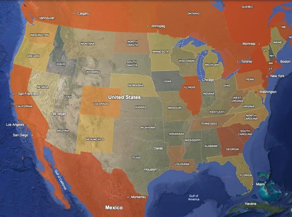
State Screen — Gun Laws / State Screen — Homeschool Laws
Two independent layers, each scoring all 50 states, DC, Puerto Rico, the 13 Canadian provinces and territories and Mexico’s 32 states on checkable statutory features rather than naming a no-go list. Every balloon itemises exactly what a jurisdiction requires and cites the statute.
Both are scored 0–100: gun law across twelve statutory features, homeschool law across seven requirements. Neither removes a state; you decide where your own line falls and read the rest of the map through it.
They are scored independently of each other and of everything else, so a state can appear in both, or neither. State law is deliberately left out of every other score, including the free State Screen, which is why these are separate tickboxes. The gun-law layer also counts laws that are enacted but not yet in force, and says so per item.
Mexico Groundwater / Mexico Population / Mexico Internet
The Mexican equivalents of well depth, density and connectivity, at aquifer and municipio level. Leave off unless you are looking south of the border.
Climate Classification / USA Risky Zones
Background context. Köppen classes with all 25 sub-classes, and three hand-drawn regions (southern border, Tornado Alley, and the Gulf and South Atlantic hurricane corridor). The risky-zones outlines are approximate by design, drawn by eye, and every balloon says so and points at the layer that measures the thing properly. Leave both off unless you want the backdrop.
Military Installations
Every DoD installation, range and training area with a published boundary, banded by area, each with a dot at its centre so the small sites stay findable when you zoom out. Turn it on before you fall in love with a parcel. The fence line is the least of it: jet noise, low-level training routes and restricted airspace run miles past it. Two balloon flags matter: sites named under CFIUS rules (it narrows who you can resell to, not whether you can buy) and sites that are closed, which often carry an environmental clean-up.
Nuclear Strike — Largest Cities / Largest Bases
Blast rings and idealised fallout plumes for one 800 kt warhead on each of the ten largest North American metros, and on twenty of the largest US bases. Read the rings as where the target itself is the hazard and the plumes as where the wind is. The plumes assume a steady 15 mph westerly, and each carries a wind envelope showing the ground it sweeps if the wind swings. The 1 R/hr plume is off by default because it runs about 700 miles. Good to about a factor of two: use it for distance, not for drawing a property line.
Canada — Cold War Bunkers / USA — Cold War Bunkers
The continuity-of-government networks: the Diefenbunker and Canada’s regional bunkers, and Mount Weather, Raven Rock, Cheyenne Mountain and the rest of the US estate. Read them as history and as neighbours, not as shelter. Most Canadian sites are gone or in civilian hands, while most US ones are still active federal facilities. Every placemark says how precise its location is, because many are only pinned to the nearest town.
Recipes
Each recipe names the layers to import together, and each one is sized to fit inside a single Google Earth project (about 10,000 features and 250,000 vertices). Import the files a recipe names, read it, then clear the project before the next one.
Rank first, then filter: your free State Screen on its own. It is a few thousand vertices, so it leaves almost the whole budget for the layers below.
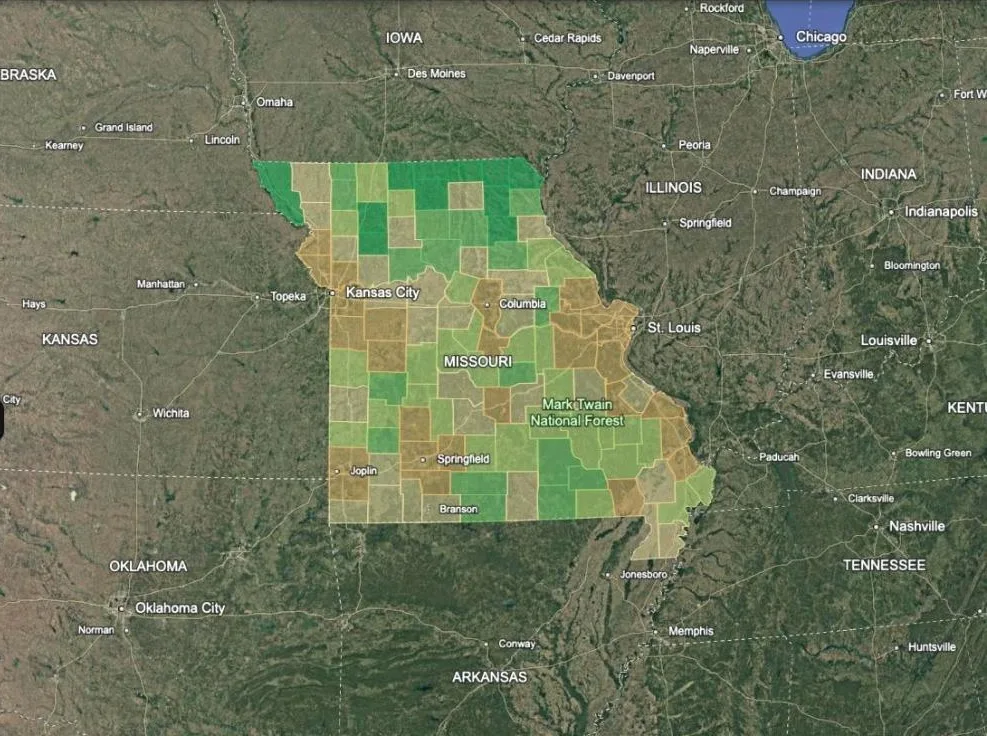
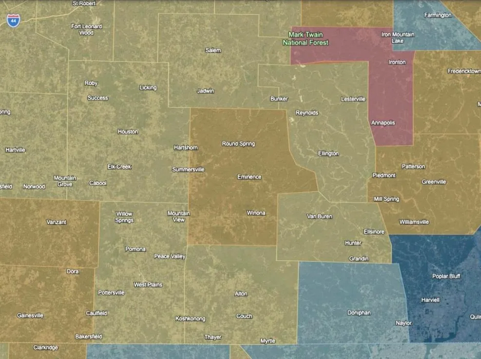
Sanity-check a county you like: Wildfire Hazard, Water Rights, Radon / Zone 1
and Well Depth, then zoom to it. Any shading that lands on it is a warning the
county-level average smoothed over. That is about 160,000 vertices — read Emergency Access in a second pass rather than adding it here.
Decide the law question yourself: State Screen — Gun Laws and State Screen — Homeschool Laws together, about 224,000 vertices — near the ceiling, so nothing else fits
beside them. Decide where your own line falls, then read your shortlist through it.
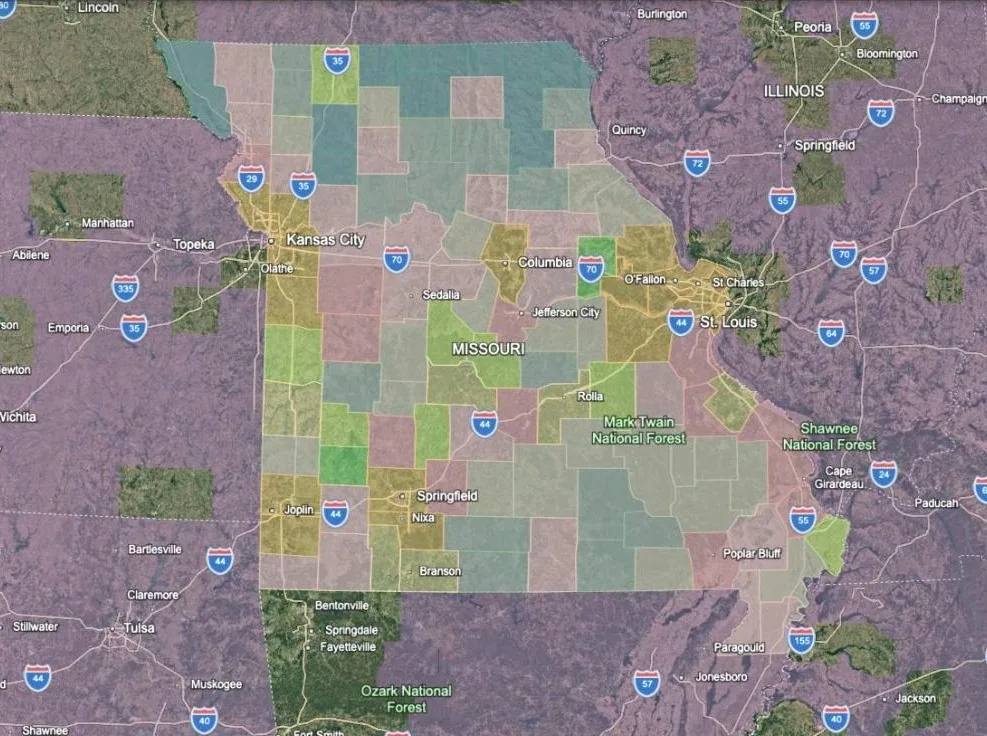
Off-grid build freedom: Building Codes / Not Resistant plus your State Screen.
Remember it cuts both ways — the same band means less regulated construction around you.
What it costs to hold, not to buy: Property Tax plus Well Depth. A cheap county
with a deep water table and a high millage is not a cheap county.
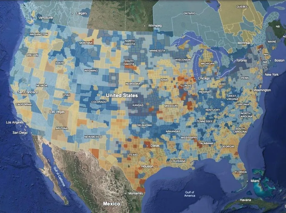
Where the water actually comes from: Annual Rainfall, Water Rights and Well Depth, about 224,000 vertices — near the ceiling, so nothing else fits beside them. What
falls out of the sky, whether you are allowed to use what crosses the ground, and what the
alternative costs to drill. Below the 20-inch band those stop being three questions.
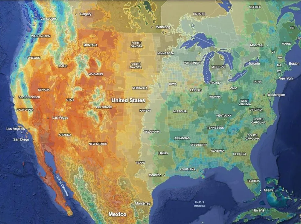
What the year actually does to you: Temperature — Winter Low and Temperature — Summer High, about 210,000 vertices for the pair that brackets the year. The first is the
heating, plumbing and what-will-grow question; the second is cooling, livestock and whether
August is workable outdoors. Neither fits beside Annual Rainfall — read that in its own
pass.
Read the trajectory before you shortlist: County Trajectory plus your State Screen.
Many of the quiet, cheap counties are losing population, and that is worth seeing before
you fall in love with a shape on a map.
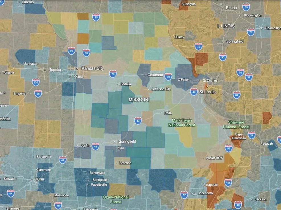
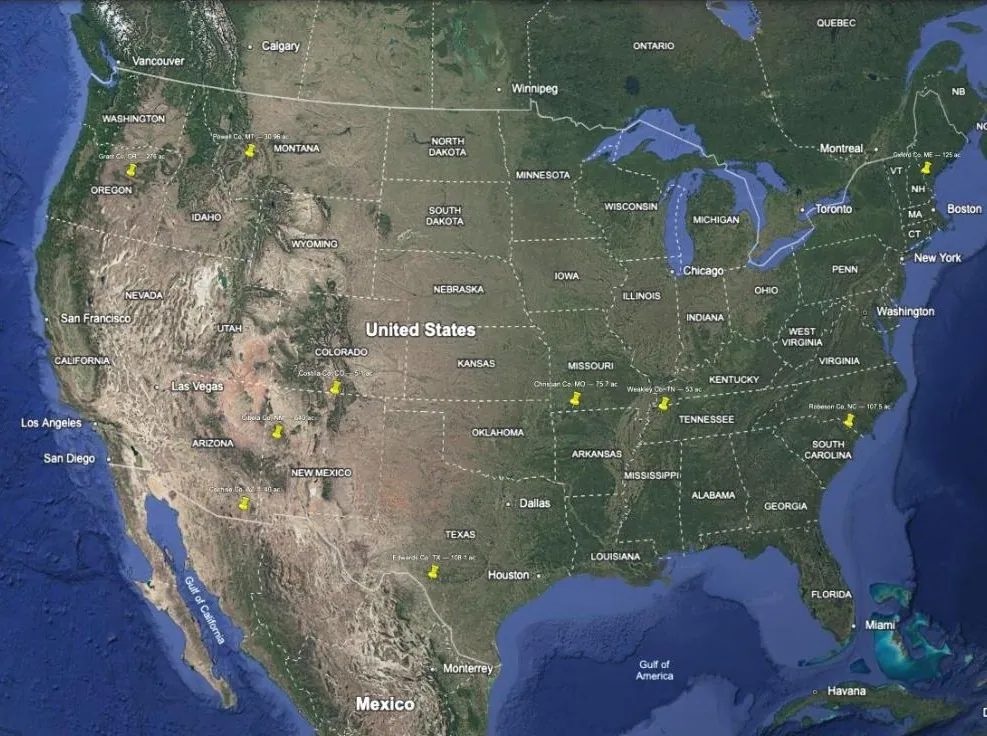
Screen your own shortlist: the properties you are looking at as pins, then one layer at a time. Drop a placemark on each listing in the same project, switch a layer on, cross off the pins it lands on in a way you can’t live with, then switch it off and turn on the next. Pins cost next to nothing against the budget, so any recipe above still fits beside them. To have them mapped for you, with a boundary on each traced from county parcel records, see preparedground.com/property-mapping — half price for complete-map owners.
What the map can’t filter on
It ranks places, not parcels. Every parcel-level disqualifier is invisible here: FEMA flood zone, landlocked or no deeded access, HOA restrictions, severed mineral or timber rights, and the actual water source. A green county means the region has the rainfall, timber, climate and price level — nothing about a specific listing.
In mountainous counties a single county-wide number means little; a valley floor and a ridge 3,000 ft up differ sharply. Each county balloon carries the within-county spread on growing season — where that spread is large, the county figure is an average of nowhere in particular.
Sources
All public, and every layer names its own in the balloon.
USDA Forest Service LCMS annual land use; NOAA 1991–2020 US Climate Normals; USFS Wildfire Hazard Potential 2023; USGS seismic design maps (ASCE 7-16); USGS/EPA geologic radon potential and the EPA Map of Radon Zones; USDA NRCS SSURGO soil survey; USGS NWIS groundwater site inventory; USGS PAD-US protected areas; CMS hospital registry; US Census ACS, TIGER and metropolitan statistical areas; Zillow ZHVI home values; FEMA Building Code Adoption Tracking; state statute for the water, gun and homeschool layers; Köppen-Geiger climate classification; CHELSA V2.1 precipitation and temperature normals. For Canada and Mexico: Statistics Canada, ISED National Broadband Data, INEGI and CONAGUA.
The datasets are free and you are welcome to go and use them. The work is in assembling, reconciling and scoring them — and in finding the places where they quietly disagree.
Disclaimer
Provided as-is, for research and educational purposes, without warranty of any kind. This is a regional screening tool built from public datasets of varying vintage and resolution. It is not a survey, an appraisal, a title search, a flood determination, or professional advice of any kind. Verify everything independently and engage qualified local professionals before purchasing property. You are responsible for your own decisions.
Questions: support@preparedground.com